

Veeva eDetail Aid Content
For the uninitiated, eDetail Aid are basically a presentation tool used by sales representative to present information to their customers.
eDetail Aid comes in many formats, and one of the most popular in the Healthcare and Pharma industry is iRep by Veeva. In this post, we will talk about how the presentation are normally structured.
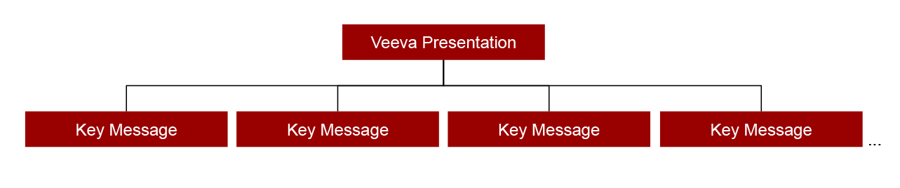
Ideally a Veeva presentation should have just enough information and not too heavy in terms of content, unless in special cases. In normal cases, a presentation should have 5 to 20 slides, or pages of information and graphs.
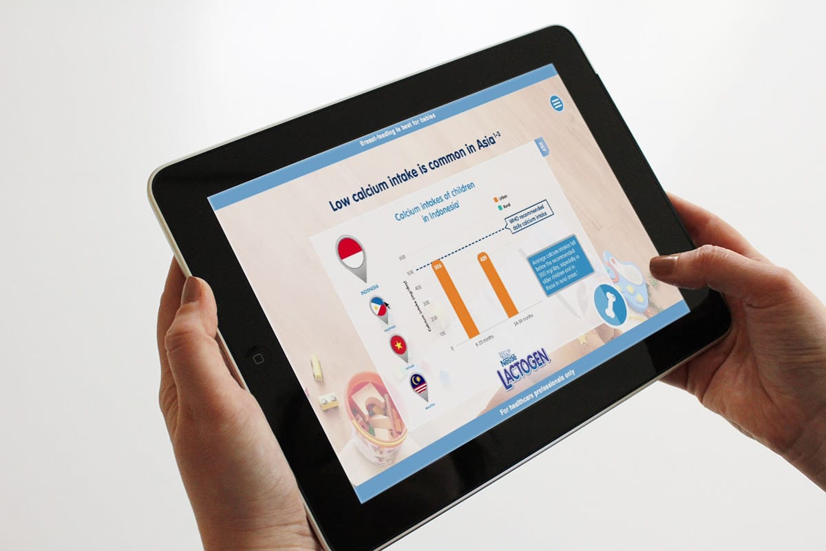
Some important pages can have animation to bring the message to live and make it more interesting that just images and text.
Key Messages
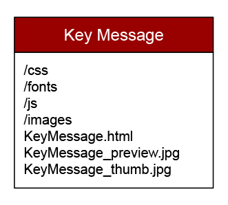
Presentation are made up of several key messages for the product and supporting content. Each key message are a HTML file and folder with accompanying assets. These are named according to the Naming Convention.
Naming Convention
Key messages and supporting content should be properly named so it is easy to sort through and works without any linking issue. We’ve also found that filename with very long names are cut off on the platform side, so its prudent to keep the filename to around 50 characters or less. They should also be unique names with a numbered prefix to sort them from beginning to end.
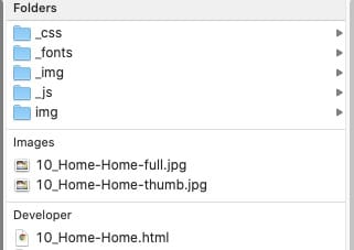
Thumbnails & Preview images
Each key message should have a thumbnail and preview image. These should be screenshots of the key message as an image.
Thumbnails are shown when a users views the presentation in the grid layout and also when the Veeva navigation bar are shown during the presentation.
Preview images are shown temporarily while the actual HTML files are loaded when user navigates to that screen.
Folder structure
Ideally, each key message will have their own folder, named accordingly, and have sub folders for images, javascript files, css files, fonts & other media. This is done so we are organised in terms of what’s needed for that particular key message/folder.
Best practices
- Try to keep file sizes of the whole presentation manageable, ie below 100-300 MB. This means reducing the amount of videos, images and key messages in a presentation. Going over this size will make the whole presentation laggy and slow to navigate.
- Don’t squeeze too many text in a single slide. Also reduce number of complex popups if possible to make each slide easy to navigate without too much tapping to access information.
- Ensure naming convention are consistent for the HTML file, thumbnail and preview images.